/Christopher John Wilson
/Christopher John Wilson
Color is all around us everyday, in the products we use, the fashions we wear and in the films we watch. Color evokes a mood. Color makes us feel a sense of emotion. But how do we discover which colors society will be drawn to next?
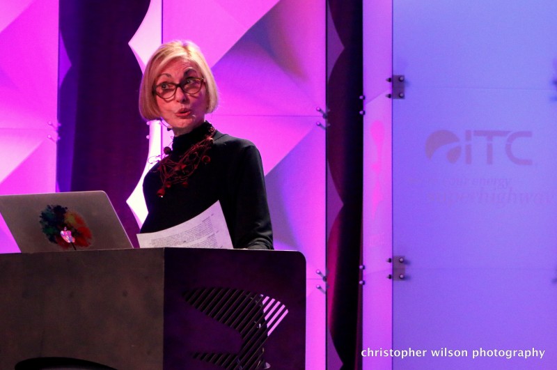
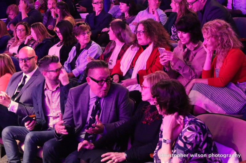
Leatrice Eiseman, executive director of the Pantone Color Institute, color and design consultant, educator, forecaster and author of nine books on color shared her insights and expertise into color trends and forecasting at the Critical Discourse presentation "Future Color/Design Trends: Innovation and Impact" on Thursday night. As one of the most influential people in the world on color, Eiseman gave a vivid presentation to a packed house on trending colors and products.
As a colorist, Eiseman emphasizes that she does not dictate, but rather pays attention to color use in various industries to forecast color trends. She looks to the drawing boards of the automotive industry, health and beauty and packaging, among others, to define the future direction of "ascending colors," meaning those colors seen on the rise in product design and prototypes.
Eiseman highlighted two contrasting and complimentary trends: umbered undertones and whimsy. Many of today’s epic films has what the colorist is referring to as "umbered undertones," which is a natural pigment of dark yellowish-brown. These desaturated colors are also trending now in the world of fashion and home design, which is a reflection of the Zeitgeist, or spirit, of our age. This somber coloring reflects the serious tones in our own cultures. With this in mind, the “Color of the Year” for 2015 is “Marsala,” a wine color defined by these trending umbered undertones. This continues Pantone's history of being the harbinger of color trends defining the Zeitgeist or the spirit of the age since 2000.
The other repeated mention in trends was the need for whimsy, zing or lightness. To balance out this somber zeitgeist, people are looking for something to make them smile, says Eiseman. These touches of whimsy show up not just in themes like owls and minion figures, but also in bright, unexpected, "happy" colors.
Emerging technologies are broadening artistic influence with innovative color and design. We are seeing a new take on old products with unexpected color usage. There is an eclectic mix trending with the juxtaposition of modern with the traditional. An uptick of humorous, whimsical product designs softens the serious side of the traditional, giving the consumer a distinctive sense of comfort.
Finding that balance between serious and fun was a noticeable trend in figuring out what consumers and creators alike are looking for in the colors around them. Eiseman says it's important to create a comfort level for people, while still giving them something new and fresh. This shows up often in traditional settings, which keeps the traditional from taking itself too seriously.
As a social response to the economic climate, Eiseman also notes that we are becoming a more responsible society of reduce, reuse and recycle- and by doing so we are prolonging color trends of years past. People are keeping products longer so the challenge for the colorist, says Eiseman, is to help keep it fresh and new.
Eiseman shared eight trending color palettes for next year that can be found in Pantone's "Pantone View: Home + Interior 2016": Dichotomy, Ephemera, Lineage, Soft Focus, Bijoux, Merriment, Footloose and Mixed Bag. Each color palette shares some colors that are comfortable- neutrals and more traditional colors- set alongside unexpected colors with pop or shimmer.
Color trends are no longer driven by the elitist, she says, but are now shared with the average consumer. We see this in art, Eiseman pointed out, as the world of art becomes more democratized.
"That whole idea of art is for the elite, we all know here- and certainly in Grand Rapids- we have seen the great democratization of art. And that is marvelous," says Eiseman. "We know that the world of art influences the world of design. And we know that artists have often used the world of design as inspiration. It's really a two-way street."
In the Fall of 2007, X-Rite, a Grand Rapids-based company bought Pantone for $180 million. X-Rite is best known for its color measurement and matching hardware products in the printing industry, and Pantone, a recognized world leader in color design and creator of the industry standard Pantone Matching System (PMS). The two companies, X-Rite and Pantone, are the perfect compliment of each other. Pantone has recently celebrated 50 years of setting the color industry standard.
The Rapidian, a program of the 501(c)3 nonprofit Community Media Center, relies on the community’s support to help cover the cost of training reporters and publishing content.
We need your help.
If each of our readers and content creators who values this community platform help support its creation and maintenance, The Rapidian can continue to educate and facilitate a conversation around issues for years to come.
Please support The Rapidian and make a contribution today.