Underwriting support from:
By Austin DeJonge, Hope College student
The voice of popular media and resulting anxiety surrounding concerns such as the war on terror, failing economy, and global warming can seem to the exhausted individual like Chicken Little’s proclamation that the sky falling: that society and all its hallowed institutions really are collapsing around us. In my 20 years, I have lived through two doomsday scares, one anthrax threat, the 911 terrorist attack, a stock market crash, and multiple school shootings—very real and serious events to be sure, but the sky nonetheless is still up there.
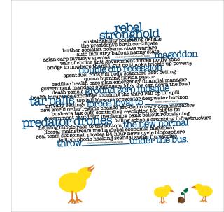
Joseph Kurnik’s digital work, Maybe the Sky is Falling, exhibited at God’s Kitchen, attempts to capture this sense of apocalyptic vision and frenzied emotions.
Kurnik employs an effective combination of imagery ressembling children's book illustrations, with text and a deft manipulation of letterforms and arrangements. The latter is not surprising for someone with a background in design, as is the case for Kurnik. The font, called “American Typewriter,” appropriately resembles those traditionally used in newspapers. The physicality of the letterforms and claustrophobic spacing underscore the physical emotion described within the content of the text. In a manner not unlike that employed by the early Modernist Dada movement, “Mad Libs” or the “magnetic poetry kits”, words which at first seem randomly strung together create an absurd sort of automatic poetry. Portions include “Quran-burning Florida Pastor,” “spent fuel rods body scanners debt ceiling,” and “predator drones falling schools’ crumbling infrastructure.”
Perhaps because of the incongruous text, it is difficult to not engage with the work. One feels compelled to get close and read the content in a futile attempt to make sense of it all. This in my opinion is the greatest strength of the piece. Not only do the words that make up the text create a feeling of tension, the subtle rotation of the text box gives you the uneasy feeling that it is in a free-fall—a visual analogy to the sense that all of these issues and problems are simultaneously crashing down on America.
During my visit to God’s Kitchen, I was fortunate enough to meet artist Joseph Kurnik and ask him a few questions about his work. Kurnik started on the piece last winter and was inspired by the news media and what he perceived to be the deliberate choice of dramatic and divisive language used to describe society. He was most pleased with how the text turned out. American Typewriter was chosen because the arcs of the letter forms would flow well with the proximity of the above and below lines.
Kurnik’s work, “Maybe the Sky is Falling,” is a brilliant representation of the news media delivered in a deliberately ironic and naïve style. Kurnik’s work, which stepped outside the norm compared to other ArtPrize works, was a simple but still detailed work with a strong message.
Had I not walked down Division, I would never have seen Kurnik’s inspiring piece. I encourage everyone to take the time to go outside of the traditional “heart” of ArtPrize and visit some of the smaller venues like that at God’s Kitchen.
The Rapidian, a program of the 501(c)3 nonprofit Community Media Center, relies on the community’s support to help cover the cost of training reporters and publishing content.
We need your help.
If each of our readers and content creators who values this community platform help support its creation and maintenance, The Rapidian can continue to educate and facilitate a conversation around issues for years to come.
Please support The Rapidian and make a contribution today.
Comments
I'm sorry to say this but I'm not as impressed by his work. There are plenty of word cloud generators out there that mash up layout, color, font and size based on the text pasted into the generator. The frequency of certain words will set the tone, and even that's at least not as self-referential as what words an individual thinks represents disasters. In fact, there are tools like Media Cloud that allow users to scrub through thousands of news outlets around the world to see what issues were most reported on and, perhaps, most inflated.
By choosing to use a word cloud, Kurnik is invoking all the technology (and freeware) around word clouds. I'm curious why he thought this would be the best way to get his message across when he did it in a way that ignored word cloud conventions and is much less impartial than a word cloud generator, which suggests themes based on what it parses.